Beauty and the Beast 'Final Pages'

Taking into account all of my development work and objectives, I truly believe that, for the most part I have achieved what I set out to in my final imagery.  Colour choice and the decision to move away from paint to favour markers cemented this style of Illustration I was not aware I was capable of. The bold colours and stark contrast to the black background (sometimes textured for scenery) made the comic intense and gave the characters unwavering personality (Beauties red hair). It also limited my decision making, red became the obvious choice for robes, hair colour, shoes, and blue castles, interiors, eyes, the beasts skull etc. It made the whole process more organic and the comic fresh and exciting. 

Using camera angles as inspiration allowed me to look upon my comic as a director might his film. I edited in the same way, taking out frames that didn't further the story, zooming in on an intense scene, even montaging or repeating when something important needed verifying. Some aspects of drawing could be improved; even though I sourced most things, drawing in front of the mirror or taking a photograph or my hands feet etc. there was not significant time spent on every frame. Instead I prioritized, giving due attention to the frames that were important to move the story forward. 

The visual language I developed allowed the comic to be suggestive without being graphic. I have met my objectives in that, there is nothing offensive about the images but there is something sinister and underlying that an adult will most certainly take from it. This, plus making a comic that is fairy tale in theme but relate-able for a modern audience were my most important objectives. The world I created pre-Xmas, the mixture of old and new allowed for that objective to me met. 


Beauty and the Beast: Rough's and Templates


Above Right: 


Example of how the pages looked when I scanned them in. This page was cut up and re-arranged by hand, then scanned in and cleaned up on Photoshop. After this I was to effectively organise the first page to look like the new and improved pages I completed after Christmas. This process was necessary because further experiments with layout and story showed me a more professional way of laying out the comic book, including a regimented border, breaks and panel size. 

The panels were created using an old system, that involved splitting up an A4 sheet into squares, and using this as a light-box template, drawing around the squares to create different sized boxes in the same vertical and/or horizontal columns. This was the the method that suited my ways of working the best. I enjoy creating things by hand and although I relied on the computer to tidy up edges and adjust levels , my objectives were always to create these comics in the most traditional way possible. The outcome was not as clean something created digitally might have rendered, however, there is something raw and traditional about the finished artworks that appeals to me and resonates with the type of work I admire. 


Above Left:

I have neglected character development for the Beast slightly. Aware from the beginning that he was never going to be fully visible (hiding in shadows, behind the Beauty) it adds a slight vulnerability to his character which makes him and the Beauties actions more empathetic and believable. However, I felt a quick sketch showing stature and shape was necessary before I furthered the project. He should be tall and opposing, as the Beauty is small and vulnerable pre dark castle and this will offer up a stark contrast. There are certain things I left up to the imagination (is he a skeleton under his clothes..?) I gave a feint implication to an actual body, his legs are not thin enough for a skeleton, nor his torso; he is simply  beast on the outside (a mystery to be uncovered) and this plays on the adult themes of the story; for the Beauty it is a coming of age story, for the Beast it is about acceptance. This should be made evident in the Beasts attire; he still dresses like a aristocrat, despite his being alone (or does this only begin when the Beauty goes to him?).


Creating the comic book rough brought to my attention that there are some compositions that are not easily executed first time and so I came up with a way of ensuring they were well drawn before I put pencil to the expensive paper I was working on. Above is an example of one of the templates; (right) I would create a few sketches and choose the appropriate one to be traced on a light-box. This eliminated any sketched lines beneath the actual artworks, and helped me to avoid the clean-up time. It was not always successful, a few mistakes were made, however, the theory did save a lot of time. 

Below: example of how the sketch was used to create a simplified, clean image. The black was a useful took that ensured any mistakes outside the line could be cleaned up with ink, some thing were patched up in Photoshop, or re-drawn and added over the original image in the programme. 


Beauty and the Beast: Rough Comic Book (film Connotations)

Note: SEE ARTIST RESEARCH PAGE FOR 'MARY BLAIR' ANALYSIS INTO COLOUR 
AND HOW THIS INFORMED MY DECISIONS

http://torupsonfmp.blogspot.co.uk/p/research-duplicate-from.html 


My pre- Christmas experiments have determined my colour choices; blue red and pink. Over Christmas I spent a lot of time thinking about the story of Beauty and the Beast and reflecting upon that in relation to my objectives. It occurred to me that my previous storyboards, although contextually correct, simply were not 'daring' or 'controversial ' enough. The sinister twist that I hoped to achieve, therefore, was not evident in my imagery. Fundamentally, all of the elements were there but the story needed to be shorter, more intense, as did the imagery. I had successful in November , found a style and media that suited my communication objectives, the black ink adding a darkness (looming-always foreboding) and the red a blue an amalgamation of innocence and severity. 

To better help me to understand how to intensify the story and get across the passion and 'intensity'of this slightly sinister relationship, I turned to film and looked into film techniques and camera angles. From this, I took the knowledge that Beauty and the Beast was best Illustrated using close-up, mid-shot and or high-angle shots to show the beasts perspective. This helped me to be 'suggestive' without having to really show anything. The love affair is applied only through hands and feet, close proximity (you fill in the blanks). In addition, this effectively, makes my comics child-proof, in that, even though I am certainly not targeting a young audience, it would not be that offensive that they would take anything much from it (other than pretty pictures). 

The main downside with the composition, is that the imagery does not vary; despite my experiments with camera angles , looking specifically at God shot and tilt shot. However, I am keen to tell the story from a set perceptive. The use of close-up shots to reveal half a picture is something that was used a lot in old motion pictures of the 30's and 40's, when there was something the census objected to, the camera would pull in to the hands or feet, or even pull of to the side on a track. This is how they got past tricky situations that were happening on film , that they didn't wish to be overly apparent, i.e 'Madonna of the Seven Moons,' 'Picnic,' 'Gaslight' etc. This technique has suited my purpose well, and is only enhanced by the use of colour, which enriches the imagery. 


Communication/The Narrative: Gesture and Expression (Telling the story using hands and feet)

 For Further research into this topic see

http://torupsonfmp.blogspot.co.uk/p/research-duplicate-from.html


JoJo's Bizarre Adventure: 

A Manga series that spans several generation's of one one family with English roots. About their misadventures. 

Written and Illustrated by Hirohiko Araki

Extremely useful in terms of influencing my story-telling techniques. This comic book series is very suggestive, but only implied, and this is done through clever imagery. The use of hands to tell the story is something that I have thought about whilst creating the storyboards for my comic book. It allows for emotions to be implied and also suggests a proximity. Smaller, broken up panels do this also, forcing the characters into a smaller space and showing an intimacy. You can see above how hands have been used in an almost tender gesture and they moves closer together as the scene progresses, leading up to a penultimate image. 

The use of facial expression in his work and the cutting together or panels; a montage of compositions, angles showing the scene from different points of view. The Illustrator clearly communicates what the characters are thinking, sometimes only showing half of a face, a section of an expression yet it is still enough to tell the story. 

HAND AND FEET:

Using hands and feet to communicate narrative was taking a leap on my part. They are notably the elements of the figure that Illustrators avoid, two of the hardest things to draw and I have chosen them as the imagery that will fuel my story. However, I feel that this is an original idea and something that I can challenge myself with, so I want to move forward with this. I have never been scared of drawing hands or feet, especially as I have always felt gesture and expression is not to be ignored in a figurative work, if you want to better communicate personality.  Touch is very important and hands not only show a proximity they can imply emotion. A clenched fist for anger or a possessive nature, stiff, spread fingers for surprise. They also show an intimacy, as hand holding or a clear need for touch is associated with love or affection. All of these things can be used to push my story forward, imply and suggest the things that 'might' be occurring outside of the frame and therefore, better suiting my communications objectives in terms of making a story that adults will appreciate, giving fairy-tales a modern significance and bringing to light their controversy. 

There was more than one reason why I felt feet would also work to further the narrative.For similar reasons to using 'hands' they show a proximity and can also imply tentativeness, hesitancy etc. Lack of shoes and socks shows when a character is comfortable or relaxed, or even their situation, the time of day (slippers or shoes), where they happen to be, where their feet are taking them. In addition, however, they also show time lapse, different shoes constitute different seasons, worn shoes show the passing of time and contrasting grandeur the stations or situations of characters


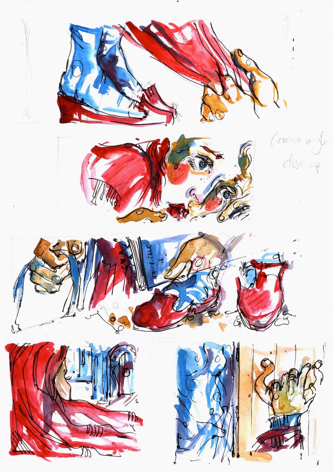
The image above is taken from the first few pages of my new storyboards. The raised heel on the woman's left foot shows how uncomfortable she is with the proximity. This is a gesture that is repeated until later in the story, when she looses her inhibitions. along with her shoes and stockings. An implication of her new-found comfort, with the Beast as man and not a monster.  

Similarly this image is taken from the scene at the beginning of the story, when the Beast drags her up the stairs to her new room in his castle. The scene that follows is slightly suggestive, the shoes above a testament to that. However, as the scene progresses you find that he was in fact giving her a dress and left her promptly. I deliberately threw the audience off her, at this point they wonder if they were imagining the 'undertones' , when in fact it just continues from this point. The Beasts grip on her wrist was an important metaphor for me; he does not take her hands because he does not feel an affection for as yet, he is simply wanting to frighten her. The next image is more interesting, he has no grip on her hand and yet she follows him up the stairs. I see this a an implication of her curiosity, she is probably too frightened to run but she cannot help but follow him.  


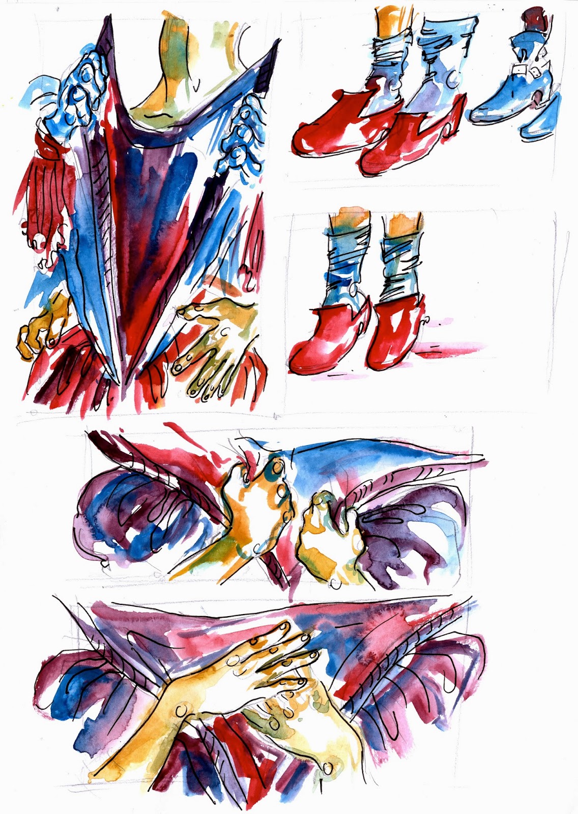
An example of 'the seduction scene' which is supposed to represent a period of time (also shown through changing costume- until the end panel where there is no costume..). This will be drawn in more detail paying closer attention to the expression on the left panel. Here we see through the use of hands, how a one sided seduction becomes mutual, I liked the idea of 'entanglement' and this the image of her hands twined with his became the 'iconography' of the piece and most likely will be the significant front cover image.'  


At this point in the story, the Beauty has just been seduced by the Beast. For the story to progress I had to show the development of true feelings between the characters; for the Beast would not let her home in in her homesickness if this were not the case. His hands are more relaxed and gentle and in this scene , we see her discard her book in favour of him. This suggests that she has found the adventure she was looking for! A massive contrast to the way she clutched her book previously to hang to her dreams and perhaps herself and her sanity, to readily allowing the book to be pushed carelessly to the floor. 


THE END: TABLES TURNED

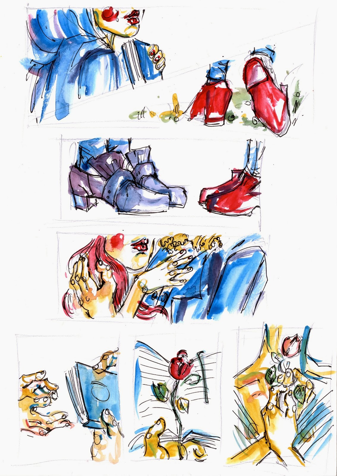
There was debate about the end of the story. I was unsure whether the Beauty should remain at home and the final image would be her imagining his hands. However, in the original story of Beauty and the Beast she had to return to him or he would die (at this point he turns into a Prince). I felt that to fully communicate my objectives she should return to him and he should remain a Beast; this we see that she is the one to alter for him as opposed to him altering to suit her. The end of the story is shows how the tables have turned. Throughout the story the Beast was sneaking up on her, giving her no way out, in this scene, we see her seducing him, they almost switch roles and we see understand that it her turn to prove her loyalty. At the beginning of the scene he is turned away from her, at the end of the story we go back to that idea of entanglement (limbs included this time). The shoes and socks are gone at the end., as is her book, a metaphor for how she is no longer the person she was before she went to the dark castle.